01274 532 100


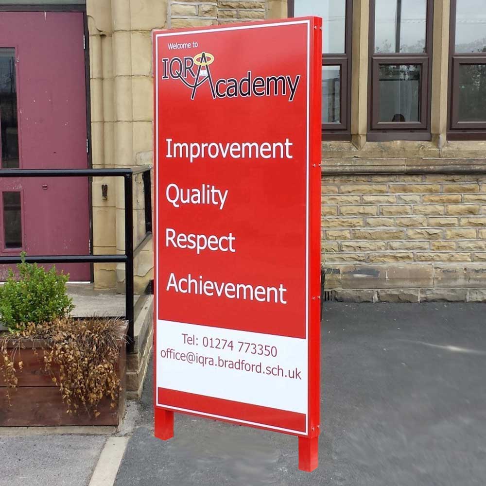
The school entrance is where visitors decide whether they are in the right place, parents judge how well the site is managed, and pupils begin their day. Custom school totem signs give that busy space a clear focal point: identifying the school, directing people safely and presenting a professional, welcoming image before anyone reaches reception.
For many schools, a totem sign is not simply a larger nameplate. It can resolve a confusing entrance, distinguish pedestrian and vehicle routes, display academy branding, and support safeguarding by making the visitor route obvious. The best result comes from treating it as part of the site plan rather than an isolated sign.
What custom school totem signs need to achieve
A freestanding monolith or totem sign is designed to be seen at a distance. Positioned near the main approach, it should help drivers slow down, help first-time visitors make the right turn, and make the entrance recognisable without adding clutter to the gate area.
Its first job is usually identification. The school name, logo and colours should be clear from the road and still legible as a visitor gets closer. This matters particularly where a school shares grounds with a nursery, children’s centre, sports facility or another academy within a trust. A well-designed sign removes uncertainty at the point where people need information most.
The second job is wayfinding. A larger site may need clear direction to reception, visitor parking, student services, deliveries or a separate early years entrance. Where access arrangements change during the day, a totem can provide the fixed, high-level information while smaller operational signs manage the detail.
Finally, it represents the school. A dated, faded or makeshift entrance sign can undermine the care invested in the building and grounds. A clean, durable sign in the school’s visual identity creates a positive first impression while remaining practical enough for a working education site.
Start with the arrival route, not the artwork
Before choosing panel sizes, colours or logos, walk the route as a parent or visitor would. Approach by car, stand at the pavement, then follow the pedestrian route from the gate to reception. The points of hesitation usually reveal what the sign must do.
Consider where drivers need to make decisions. If the school entrance is set back from the road, obscured by hedges or close to a junction, the sign must be readable earlier. If several entrances sit along one frontage, the wording must make the correct access point unmistakable. A sign that looks excellent beside reception but cannot be read until a driver has passed the turning is not doing its main job.
Look at sightlines in every season. Low winter sun, parked cars, mature trees, fencing and morning traffic can all affect visibility. Positioning is often more valuable than adding extra text. A clear sign in the right location is safer and more useful than a larger sign placed behind visual obstructions.
It is also worth separating vehicle and pedestrian messages. Trying to place school identity, visitor instructions, parking restrictions, safeguarding reminders and directional arrows on one panel often creates an overloaded display. A totem sign should provide the headline information. Pavement signs, parking control signs and entrance notices can reinforce the specific action required closer to the relevant area.
Choosing the right information for a school totem sign
Most schools benefit from a restrained hierarchy. The school name and logo should lead. A short descriptor, such as ‘Main Reception’ or ‘Part of [Trust Name]’, can sit beneath where needed. Directional arrows, visitor parking details or a clearly marked entrance may follow, provided the layout remains easy to scan.
Telephone numbers, lengthy mission statements and extensive lists of facilities are rarely effective on an entrance totem. They may be useful elsewhere, but they compete with the information a visitor needs while moving. If a car is approaching a busy gate at drop-off time, the message must be understood in seconds.
Brand colours should be used carefully. Strong school colours can make a sign memorable, but contrast is what makes wording readable. Dark text on a light panel, or light text on a dark panel, will usually perform better than similar tones placed together. Logos also need enough clear space to retain their shape and impact from a distance.
For schools within a multi-academy trust, agree the branding structure early. Some sites need the trust logo visible alongside the school identity; others need the individual school name to take clear priority. A consistent approach across the estate supports trust recognition, but each site still needs signage that works for its own road layout and visitor flow.
Make the reception route obvious
Visitor management starts before the front door. Where a visitor entrance differs from a pupil gate, the route should be direct and unambiguous. Clear reception wording on a totem, combined with appropriate directional signage, helps prevent adults entering through unsuitable gates or walking around the site looking for assistance.
This is a safeguarding consideration as well as a customer-service improvement. Visitors who know where to report are more likely to follow the school’s procedures from the outset.
Materials, construction and durability
External school signs work hard. They face rain, frost, UV exposure, footballs, bicycles, grass-cutting equipment and the occasional vehicle manoeuvre. Material and installation choices should reflect the location rather than be based on appearance alone.
Aluminium composite panels are a popular option for their smart finish, weather resistance and suitability for printed graphics. A folded tray or more substantial monolith construction can give a greater sense of permanence for a prominent main entrance. The right choice depends on the desired visual impact, panel size, exposure and budget.
A double-sided totem can be valuable where vehicles approach from both directions or where the sign needs to serve the road and internal site route. However, a single-sided sign may be sufficient against a boundary or wall, and can reduce cost. Illumination is another site-specific decision. It can help where evening events, community use or winter visibility are priorities, but it introduces power, maintenance and installation considerations that do not suit every school.
The foundations deserve equal attention. A tall freestanding sign needs suitable ground preparation and secure fixing to remain stable and presentable. Existing underground services, drainage, tree roots and access for installation all need checking before a final position is agreed. For prominent signs near a public highway, schools should also consider whether planning consent or other local requirements may apply. Requirements vary by location, scale and setting, so early checks avoid delays.
Pair the totem with practical safety signage
An entrance sign cannot solve traffic issues alone. If parents are stopping on zig-zag markings, blocking driveways or leaving engines running beside waiting pupils, clear traffic management signs are still needed at the points where behaviour must change.
The most effective school sites use a joined-up approach. The totem identifies the school and directs visitors. Parking signs set out restrictions. road safety signs encourage drivers to slow down and remain alert. A pavement buddy can carry a timely reminder at drop-off and collection. Together, these products make the site feel organised without covering every surface in competing notices.
Keep messages consistent. If the entrance totem directs visitors to reception, gate signage should use the same wording. If the school promotes a no-idling message, repeat the approved wording where drivers queue. Consistency reduces confusion and gives staff a clearer basis for conversations with parents and visitors.
Planning a specification that lasts
A useful brief for a custom sign supplier includes a photograph of the proposed location, approximate measurements, details of the approach direction, the school logo in its best available format, brand colours and the exact wording required. It should also state whether installation is needed and identify any access restrictions, such as narrow gates, limited vehicle access or work that must take place outside term time.
Ask for artwork that can be checked by the people who use the site every day. The headteacher may focus on school identity, while the site manager may spot a practical issue with vehicle visibility or ground conditions. Reception staff can often identify the questions visitors ask most frequently. Bringing those perspectives together before production prevents expensive changes later.
Signs 2 Schools can help schools translate these operational requirements into custom monolith totem signs that fit the site, brand and visitor journey. The aim is not to add signage for its own sake, but to make every arrival calmer, clearer and safer.
A well-placed totem sign gives a school a confident welcome while quietly guiding people towards the right decisions. When it reflects the real movement of pupils, parents, visitors and vehicles, it becomes a practical part of a safer school day.