01274 532 100


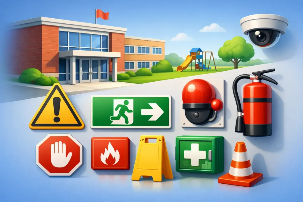
A missing warning sign at a delivery point, a faded playground instruction board or a car park notice hidden behind a hedge can create problems long before anyone raises them in a site meeting. In schools, safety signage standards are not just about ticking a compliance box. They affect how pupils, staff, parents, contractors and visitors move around site, understand risk and respond quickly when something needs to be clear at a glance.
For education settings, that matters more than it does on many other sites. A school has young children, busy arrival and departure periods, changing visitors, safeguarding considerations and outdoor spaces used in different ways across the day. Good signage needs to meet recognised standards, but it also needs to work in the real conditions of a live school environment.
What safety signage standards are meant to achieve
Safety signs are there to communicate essential information quickly and consistently. In practical terms, that means using recognised shapes, colours, symbols and wording so people can understand a message without hesitation. On a school site, that might involve warning of a vehicle route, marking a fire exit, prohibiting smoking, identifying a first aid point or directing visitors to reception.
The point of standards is consistency. If a prohibition sign is red and circular, or an emergency escape sign uses the familiar green format, people do not need to relearn the meaning every time they enter a new building. That consistency supports quicker decision-making, especially where attention is split or people are unfamiliar with the site.
In the UK, school leaders and site teams usually think about signage through the wider lens of health and safety duties. Signs do not replace proper risk control, staff procedures or supervision. They support them. If traffic movement near the school gate is unsafe, a sign on its own is rarely enough. But clear, well-positioned signage can reinforce the rules, guide behaviour and reduce confusion.
Safety signage standards in a school context
The challenge for schools is that compliance and usability are not always the same thing. A sign can be technically correct and still fail because it is too small, poorly positioned or overwhelmed by visual clutter. Equally, a sign can be friendly and visually appealing but fall short if it weakens a recognised safety message.
That is why school sites need a balanced approach. Safety signage should follow recognised conventions while still being suitable for the age range, layout and operational needs of the setting. A nursery entrance, a secondary school science block and a college service yard will not all need the same presentation.
This is where site-specific thinking matters. The best results come from asking simple operational questions. Who needs to read this sign? When do they see it? Are they on foot or in a vehicle? Do they have only a few seconds to respond? Is the sign supporting safeguarding, traffic management, premises safety or emergency information?
The main categories schools should understand
Most school safety signs fall into a few familiar groups. Prohibition signs tell people what they must not do, such as no smoking or no unauthorised entry. Warning signs alert people to hazards such as uneven surfaces, vehicle movements or slippery conditions. Mandatory signs state an action that must be taken, such as keeping a gate closed or wearing protective equipment in a specific area. Safe condition signs identify emergency exits, assembly points or first aid locations. Fire equipment signs show where fire-fighting equipment is located.
For many schools, the day-to-day issues are less about obscure technical categories and more about whether signs are covering the real risks on site. Parking and traffic control are common examples. A road sign outside the gate, a parent parking reminder and a staff car park instruction board may all serve different purposes, even though they are part of the same wider safety picture.
Where schools often get signage wrong
The most common issue is not a total lack of signage. It is inconsistency. Sites often build signage over time, adding pieces in response to individual problems. One year it is a safeguarding notice, the next it is a delivery warning, then an exam quiet sign, then a parking restriction. Before long, entrances and gates become crowded with mixed styles, duplicate messages and signs that compete for attention.
Another issue is poor placement. If a driver only sees a parking instruction after turning into a congested area, the sign has arrived too late. If a visitor cannot find reception from the car park, they may walk through the wrong entrance. If a fire exit sign is partially hidden by a display board, its value is obvious only after a problem has already started.
Condition matters too. Outdoor signs in schools take a lot of wear from weather, vehicle spray, tampering and everyday knocks. A cracked panel, faded print or bent post can make an otherwise correct sign ineffective. Site teams are right to treat signage as part of premises maintenance, not a one-off purchase.
Choosing signage that meets standards and works for schools
A school should start with risk, not with product type. Look first at where confusion, unsafe behaviour or repeated incidents are already happening. That may be the main gate, parent parking areas, the reception route, a shared pedestrian and vehicle zone or a contractor access point.
From there, the sign has to do a practical job. It needs the right message, enough visibility and the right level of durability. External traffic signs need to be readable from a distance. Playground and pedestrian notices need to sit at the right height and be visible in busy areas. Interior signs need to be clear without making corridors feel over-signed and unwelcoming.
Schools also have to think about audience. Adults can process denser information than younger pupils. In some settings, symbols and concise wording work better than long text. In others, especially where visitors and contractors are involved, slightly more explicit wording may be appropriate. The right answer depends on who is expected to act on the message.
Why design still matters with safety signage standards
There can be a temptation to treat all compliant signage as interchangeable. In practice, design has a direct effect on whether a sign gets noticed and followed. Size, contrast, layout, symbol clarity and installation position all shape legibility.
For schools, there is an extra consideration. The site should feel safe and well managed without becoming harsh or visually chaotic. That does not mean softening essential warnings. It means selecting signage that communicates firmly while fitting the wider environment. A primary school, for example, may need child-friendly presentation around wayfinding and behaviour messaging, while keeping formal safety signs clear and recognisable where required.
This is one reason specialist education signage can be more effective than generic off-the-shelf options. The issue is not simply whether a sign can be printed. It is whether it suits a live school environment where safeguarding, parent communication, pupil movement and visitor management overlap every day.
Reviewing your school against safety signage standards
A practical review is often more useful than a broad compliance exercise on paper. Walk the site as a parent, a new pupil, a contractor and a delivery driver would. Start at the perimeter, then move through the arrival route, reception area, car parks, playground edges, service zones and key internal corridors.
Check whether messages are visible before a decision point, not after it. Check whether wording is still current, whether signs contradict each other and whether older boards have become part of the background. If staff regularly need to explain a route or repeat a rule in person, signage may not be doing enough of the work.
It is also worth checking where one sign is being asked to solve a wider management problem. For example, unsafe parking near school entrances often needs a combination of clear signage, markings, barriers and communication with parents. Standards matter, but site control matters as well.
When custom signage is the better option
Standard safety signs are essential for many core requirements, but schools often need custom signage where the message is specific to the site. Visitor instructions, safeguarding notices, drop-off arrangements, one-way traffic systems and school-specific parking controls are common examples.
Custom does not mean informal. It should still use clear hierarchy, sensible wording and, where relevant, recognised visual conventions. The benefit is that the sign can reflect the actual issue the school is facing rather than forcing a generic message into a local problem.
For schools managing multiple priorities at once, this is often the difference between a sign that gets ignored and one that changes behaviour. A specialist supplier such as Signs 2 Schools understands that a message outside a nursery gate needs a different balance from one at a college service entrance.
Keeping standards practical, not theoretical
The schools that manage signage well usually do one thing consistently. They treat signs as part of day-to-day site operations. That means reviewing them after layout changes, replacing damaged items promptly and considering signage whenever a recurring safety issue appears.
Safety signage standards provide the framework, but good judgement makes them useful. A sign should be compliant, visible, durable and right for the people using the site. If it helps prevent hesitation at a fire exit, confusion at reception or risky behaviour at the school gate, it is doing more than meeting a standard. It is supporting a safer, calmer school environment for everyone on site.
The most effective signage is often the kind people barely notice because it gives them the right instruction at exactly the right moment.