01274 532 100


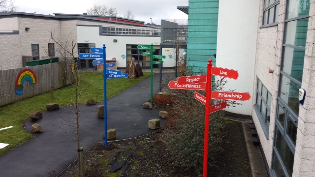
The entrance is where parents decide whether they know where to go, visitors learn how to report in, and pupils form an impression of the day ahead. It is also where poor parking, unsecured access and unclear directions can create avoidable pressure. Knowing how to choose school entrance signage means looking beyond a logo board and planning a clear, safe route from the school gate to reception.
For many schools, the right answer is not one large sign. It is a coordinated set of entrance signs that welcome people, direct them, reinforce safeguarding procedures and support the site’s visual identity without creating clutter.
Start with the real job your entrance signage must do
Before choosing materials, colours or wording, consider what happens at your entrance during the busiest ten minutes of the day. Watch the arrival and collection period if possible. Are families parking inconsiderately? Do visitors walk towards the wrong door? Are delivery drivers unsure where to stop? Does the reception team spend time repeating basic instructions?
A school entrance sign should solve a specific operational problem. A prominent main entrance sign may help visitors find reception, but it will not address vehicles stopping near the gate. Likewise, a polite parking notice may be necessary, but it cannot replace clear pedestrian wayfinding.
Most school sites need signage to perform four connected roles:
- identify the school clearly from the road or approach
- direct pupils, parents, visitors and contractors to the correct entrance
- communicate safety, security and safeguarding expectations
- create a welcoming, professional first impression
The balance depends on the site. A small nursery may need child-friendly welcome signage and a firm visitor-reporting instruction. A large secondary school or academy may need separate directions for reception, sixth form, deliveries, accessible access and sports facilities. Do not assume that a sign package suitable for one setting will work for another.
Audit the journey before you order
The most effective way to choose school entrance signage is to walk the route as a first-time visitor. Begin where a person first sees the site from the road, then follow the likely path to reception. Take photographs and make notes on every point where someone could hesitate, turn the wrong way or enter an unauthorised area.
Look in particular at the boundary, car park, pedestrian gate, main building approach and reception door. Signs that look clear when viewed close up may be invisible from a vehicle, blocked by parked cars or obscured by planting. Seasonal changes matter too. A sign partly hidden by summer foliage or poorly lit on a winter afternoon is not doing its job.
At this stage, distinguish between information that everyone needs and information for a smaller group. The school name and main reception direction should be immediately visible. Details such as contractor instructions, delivery procedures or appointment-only access can sit closer to the relevant point of use.
It is also worth asking reception staff, site teams and crossing patrols what questions they hear repeatedly. Their answers often reveal where an entrance sign is missing, poorly positioned or trying to say too much.
Choose the right types of school entrance sign
Main identity signs
Your main identity sign establishes that visitors have arrived at the right place. Depending on the setting and available space, this could be a wall-mounted sign, a post-mounted panel, a freestanding monolith or totem sign, or a sign integrated with the school boundary.
A monolith or totem can be especially useful where the entrance is set back from the road or several buildings share one campus. Its height and double-sided visibility help drivers identify the site earlier. However, it needs adequate space, suitable foundations and a position that does not reduce sightlines for vehicles or pedestrians.
For a compact site, a well-designed wall sign at the entrance may be more practical. The priority is clear school identification, not simply choosing the largest format available.
Directional and wayfinding signs
Once visitors are on site, directions must be simple and consistent. Use clear arrows, familiar wording and the same naming conventions used by staff. If the sign says “Visitor Reception”, the person at the desk should not refer to it as “Front Office”.
Keep each directional sign focused. A board carrying six arrows, long policy statements and several logos forces people to stop and interpret it, which is unhelpful during busy drop-off periods. Where several destinations are necessary, use a hierarchy: reception first, then key visitor destinations, then secondary facilities.
Safeguarding and security signs
Entrance signage is part of safeguarding practice. Visitors need to know where to report, which entrances are not in use and whether access is controlled. Clear messages such as “All visitors must report to reception” are more useful than vague notices that assume people understand site routines.
Security signage should be firm without making the school feel hostile. A clean, professionally produced instruction at the point of entry carries more authority than a collection of faded paper notices. If CCTV, restricted access or sign-in procedures apply, display relevant information where people can act on it.
Parking and pedestrian safety signs
The school gate is often the most challenging part of the site. Parking control signs, pavement buddies and road safety messages can help reduce dangerous stopping, blocked crossings and engine idling. Their effectiveness depends heavily on placement and wording.
A message such as “Protect our children, turn off your engine” works best where drivers are waiting, not hidden behind a hedge or placed after they have left the vehicle. Similarly, no-parking or keep-clear signs should be positioned before motorists reach the problem area, with enough visibility to influence their decision.
Get wording, colour and design right
School entrance signs should be readable in seconds. Use plain English, short instructions and sufficient contrast between text and background. Decorative fonts, lengthy welcome messages and low-contrast colour combinations may look attractive on screen but can be difficult to read outdoors.
Your school colours and logo should be present, particularly on identity signage, but they should not overpower the message. A visitor needs to see “Main Reception” before they admire the brand palette. For schools with strong visual identities, a consistent colour system can work well: one colour for visitor routes, another for parking information and a distinct format for safety notices.
Consider the audience too. Primary settings may use warmer, more child-friendly graphics, while a college may need a more formal appearance. Both still require legible text, clear hierarchy and durable finishes. Child-friendly does not mean childish, and professional does not mean unwelcoming.
Specify materials for the location, not just the budget
External school signage has to cope with rain, frost, sunlight, footballs, cleaning and daily footfall. The cheapest option may be reasonable for a short-term event notice, but it is rarely the best choice for a main entrance sign that represents the school year after year.
Think about where the sign will be installed. Wall-mounted panels need a secure, suitable surface. Post-mounted signs need appropriate posts and ground conditions. Freestanding signs may require foundations and should be planned with underground services in mind. For high-contact areas, choose materials and finishes that are easy to clean and resist scratching or fading.
There is also a maintenance trade-off. Digital displays can be useful where messages change frequently, but they need power, content management and ongoing attention. A traditional noticeboard offers flexibility without electrical work, while fixed panels are ideal for information that should remain constant. Many sites benefit from a combination rather than relying on one format.
Plan for accessibility and inclusive communication
Good entrance signage should help everyone navigate the site, including people who are unfamiliar with it, have mobility needs, are visually impaired or do not have English as their first language. This does not require every sign to carry every instruction. It requires a logical route, consistent symbols and readable information at the right height and location.
Make sure accessible parking, step-free routes and accessible entrances are signed before someone reaches an obstacle. If visitors must use an intercom or ring a bell, identify it clearly and position instructions where they can be read comfortably. Avoid placing essential directions behind gates that may be closed when visitors need the information.
For large or complex sites, a simple visitor map at the entrance can reduce confusion. Keep it uncluttered and show only the landmarks a visitor needs, such as reception, car park, pedestrian routes and key buildings.
Involve the people who run the site
Entrance signage affects more than the person placing the order. Involve reception, the site manager, safeguarding lead and, where relevant, the school business manager or trust estates team. They will identify practical issues such as vehicle movements, emergency access, cleaning routines, planning restrictions and local authority requirements.
Agree who will approve final wording and artwork before production. This is particularly important when using school logos, academy trust branding, multilingual wording or safety messages. Check phone numbers, postcodes and email addresses carefully. A sign is a long-term purchase, and a small error becomes very visible once installed.
If you are ordering custom signage, provide photographs and measurements of the proposed location. A specialist school signage supplier can then advise on format, sizing, fixing methods and whether the planned sign will be visible from the intended approach.
Make the entrance work harder for your school
A well-planned school entrance does not need to be crowded with notices. It needs to answer the right questions before they become interruptions: Where am I? Where do I go? What do I need to do? Is this a safe place to be?
Choose signs that reflect the character of your school, but let safety, wayfinding and safeguarding lead every decision. When families, visitors and pupils can move confidently from the gate to reception, the whole site feels calmer, more organised and more welcoming.