01274 532 100


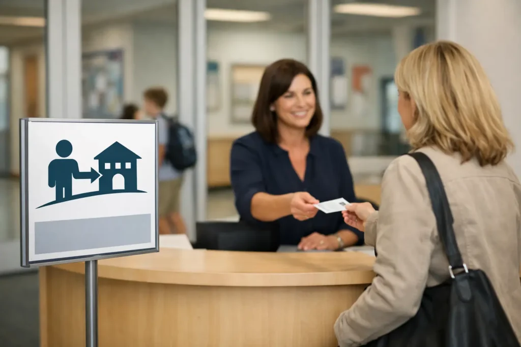
At 8.35am, a new parent, contractor or agency visitor should not have to guess where to park, which door to use or how to report to reception. Well-planned visitor welcome signs for schools make those decisions clear before someone reaches the building. They also set the tone: this is a friendly, organised site where pupils’ safety is taken seriously.
For school leaders, office teams and site managers, an entrance sign is not simply a branding exercise. It supports safeguarding procedures, reduces interruptions at reception and helps visitors follow the same route every time. The best solution is usually a small, coordinated group of signs rather than one large board expected to do every job.
What a school welcome sign needs to achieve
A visitor’s experience begins at the site boundary, not at the reception desk. If the entrance is unclear, visitors may drive through a busy pedestrian area, use a pupil entrance or wait in the wrong place. This creates avoidable pressure for staff during the busiest parts of the day.
A clear welcome sign should identify the school, direct visitors to the correct entrance and explain the immediate action required. In many settings, that means a message such as: “Welcome to [School Name]. All visitors must report to reception.” Where the route is less obvious, an arrow, entrance label or separate directional sign is essential.
The wording needs to be welcoming without weakening the instruction. “Please report to reception” is polite, but it should remain prominent and easy to read from a sensible distance. A visitor should not need to stand beside the sign to understand what to do.
For schools with a public-facing reception near the main gate, a single entrance sign may be enough. Larger campuses, split sites and shared premises usually need a sequence: a sign at the vehicle entrance, a directional sign at the pedestrian route and a final instruction at the reception door.
Visitor welcome signs for schools and safeguarding
A welcome sign is part of the wider visitor-management process. It cannot replace sign-in procedures, ID checks, lanyards or staff supervision, but it can make every later stage more effective. When expectations are visible before a person enters, office staff spend less time repeating basic directions and more time carrying out appropriate checks.
The most useful safeguarding messages are specific. Rather than relying on a broad statement about site rules, tell visitors what is expected at that point in the journey. For example, a main entrance sign may ask all visitors to report to reception, while a reception-area notice can cover signing in, wearing a visitor badge and remaining with a member of staff where required.
There is a balance to strike. An entrance crowded with warnings can feel unwelcoming and can make the key instruction harder to spot. Keep the welcome and reporting message on the main sign, then position detailed safeguarding information where visitors have time to read it. A separate safeguarding notice, photo policy sign or mobile phone instruction can be placed beside reception or in the waiting area.
This approach also helps schools with different visitor groups. Parents attending an appointment, contractors arriving for planned works, supply staff and delivery drivers do not always need the same information. A clearly marked service entrance, contractor reporting point or delivery instruction can prevent these visitors from using the pupil entrance.
Start with the approach to the building
Before choosing a sign size or design, walk the route as a first-time visitor would. Arrive by car and on foot if both are common. Look for the point where a person first needs reassurance that they are in the right place, then identify every decision they must make before reaching reception.
Pay close attention to parking and traffic flow. A welcome sign positioned behind parked cars, bins or landscaping may be technically present but operationally useless. If visitors regularly stop at the gate, block the entrance or use staff parking, the issue may need a separate parking control sign before they reach the welcome board.
For many schools, the most effective layout includes a branded sign near the entrance, a clear visitor parking instruction where appropriate and a pedestrian direction sign leading to reception. At busy schools, pavement signs can provide temporary or changeable guidance for open evenings, performances, elections or building works. They should be positioned where they do not obstruct access, wheelchair users or pushchairs.
Check sightlines and reading distance
Lettering that looks generous on a computer screen can be too small when viewed from a car or across a playground. The most important words should be the largest: the school name, “Visitors” and “Reception” are common priorities. Keep secondary wording concise and avoid dense blocks of text.
Colour contrast matters as much as font size. A school may have a detailed logo and a broad colour palette, but the sign still needs to work in rain, low winter light and glare. High contrast text and simple symbols are often more effective than a design with several competing colours.
Consider who will use the sign. Younger children, visitors with visual impairments and people unfamiliar with English may benefit from straightforward pictograms and plain language. Accessibility is not an add-on – it improves clarity for everyone.
Choose materials for a working school site
External visitor signage needs to withstand British weather, daily footfall and the occasional football or bicycle. The right material depends on where the sign will be fitted, how permanent it needs to be and whether the information is likely to change.
A fixed aluminium composite panel is a practical choice for a permanent main entrance sign. It offers a professional finish and suits branded welcome messages, directional arrows and reception instructions. Where the sign needs to stand independently, a post-mounted panel or monolith-style totem can give the entrance greater presence, particularly on larger academy, college or shared-campus sites.
Wall-mounted signs work well where visitors approach a clearly defined reception door. They are often more economical than freestanding signage, but only if the wall is visible from the approach route. If the building is set back from the road, a sign at the boundary may still be needed.
Temporary situations require a different answer. A pavement buddy can help direct visitors during an event or while a reception route changes, but it should not become a permanent substitute for clear fixed signage. If staff put out the same temporary sign every morning, it is usually time to invest in a more durable solution.
Design around the school’s identity, not just its logo
A school entrance should look recognisably like the school it belongs to. Consistent colours, logo use and typefaces help visitors feel that they have arrived at the right place. They also support a positive first impression for prospective families, governors and external professionals.
However, branding should serve the message rather than dominate it. A large crest, busy photograph or lengthy mission statement can reduce the space available for practical direction. The school name and visual identity should be clear, but “Visitors report to reception” must remain instantly visible.
For nurseries and primary schools, child-friendly graphics can make an entrance warmer and less intimidating. For secondary schools, colleges and universities, a cleaner, more formal design may be more appropriate. Both approaches can be welcoming. The deciding factor is whether the design reflects the setting while keeping instructions clear.
Custom signs are especially valuable where a site has unusual access arrangements, multiple buildings or a shared entrance. Signs 2 Schools can help schools combine their own identity with the operational messages visitors need, rather than forcing important instructions into a generic format.
Avoid the common gaps
The most frequent problem is assuming reception is obvious. It may be obvious to staff, but a first-time visitor does not know which door is used by pupils, which one is locked or whether they should press an intercom. Label the route and the reporting point clearly.
Another gap is treating the welcome sign as separate from parking management. A polished entrance board cannot solve cars stopping on zig-zag lines, blocking gates or idling outside classrooms. Where these issues occur, use clear road safety and parking messages at the point of behaviour, alongside the visitor direction signs.
Finally, review signs after changes to the site. New fencing, a relocated office, altered gates or a building project can make an existing sign inaccurate overnight. Ask a colleague who does not use the entrance every day to follow the visitor route and note where they hesitate. Their experience will reveal more than a sign plan viewed from behind a desk.
A good visitor welcome sign does a quiet but valuable job: it reassures genuine visitors, directs them confidently and makes the right behaviour the easiest behaviour. When the route to reception is clear from the first glance, your team can focus on the people arriving rather than the confusion around them.