01274 532 100


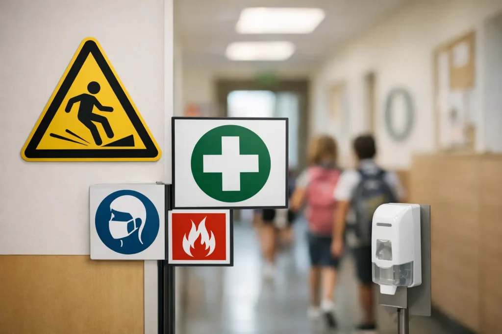
A wet floor outside the dining hall, a delivery vehicle reversing near the gates, a fire door left open during a busy changeover: these are everyday school risks that need an immediate, clear response. School health and safety signs give pupils, staff, visitors and contractors the information they need at the point they need it. The best signs do not simply fill a compliance folder. They help people make safer decisions without needing to ask for directions or instructions.
For schools, nurseries, academies and colleges, effective signage must work for a mixed audience. It needs to be understandable to young children, visible to busy staff, useful to visitors unfamiliar with the site and durable enough for the British weather. That calls for more than a generic warning notice placed wherever there is spare wall space.
Start with the risks on your school site
Health and safety signage should follow the risks identified through your premises inspections and risk assessments. Walk the site as a new parent, a pupil, a contractor and a member of staff would. Each person takes a different route and notices different things.
The entrance is a sensible starting point. Visitors need to know where to report, whether they must sign in, which areas are restricted and what safeguarding procedures apply. Clear visitor and reception signs reduce the chance of someone walking straight into the school building or following a pupil through an unsecured entrance.
Then consider the places where routines become hurried. Car parks, drop-off zones, pedestrian crossings, playground gates, corridors, kitchens, science rooms, workshops, sports areas and plant rooms all need messages suited to their specific hazards. A sign saying “Danger” may be technically visible, but it is rarely as useful as a direct instruction such as “Keep Clear”, “Authorised Staff Only” or “Children Crossing”.
Do not overlook temporary risks. Cleaning, maintenance, deliveries, school events and adverse weather can change the safety picture quickly. A pavement buddy for a wet floor or a temporary no-parking message may be more effective than a permanent sign because it appears exactly when the hazard exists.
Match the sign type to the message
A well-planned sign scheme uses recognised safety formats consistently. This makes messages faster to understand, particularly for children and people who are visiting for the first time.
Warning signs draw attention to a hazard, such as slippery surfaces, low ceilings, hot water or moving vehicles. Prohibition signs tell people what they must not do, for example no smoking, no unauthorised access or no parking at the school gate. Mandatory signs set out an action, including wearing eye protection or keeping fire doors shut. Safe-condition and fire safety signs help people locate exits, first aid points, assembly areas and emergency equipment.
The wording still matters. Keep it short, direct and appropriate to the reader. “No Running” works in a corridor. “Slow Down – Children Crossing” is clearer for drivers entering the site. For younger pupils, use simple language alongside clear symbols and, where suitable, friendly visual cues. The aim is to guide behaviour, not to create a wall of instructions that nobody reads.
Signs for traffic and parking pressure
The school gate is often where safety communication has the greatest immediate effect. Parking on zig-zag lines, stopping near crossings, idling engines and vehicles turning in restricted spaces can all put children at risk. Schools also need to protect access for emergency vehicles, deliveries and accessible parking.
Road safety signs, parking control signs and pavement buddies can reinforce the rules at the precise point where drivers make decisions. Messages such as “Keep Clear”, “No Stopping”, “Staff Parking Only” and “Protect Our Children, Turn Off Your Engine” are practical prompts rather than background decoration.
Positioning is crucial. A sign hidden behind parked cars, trees or open gates will not solve the problem. Consider the driver’s approach, viewing distance and likely stopping point. In some settings, a combination of fixed entrance signs and movable pavement signs works best, especially at morning drop-off and afternoon collection.
Signs inside buildings
Indoor signage needs to support safe movement and daily management. Directional signs prevent visitors from wandering into teaching areas. Fire exit, first aid and assembly point signs support emergency arrangements. Kitchen, caretaking, cleaning and maintenance areas require clear access restrictions and hazard warnings.
In specialist spaces, make the signs relevant to the activity. A science department may need reminders about eye protection, handwashing and chemical storage. A design and technology room may need machinery warnings and instructions for protective equipment. Sports halls and playgrounds may need messages about safe equipment use and suitable footwear.
It depends on the age range of your pupils. Secondary schools may use more detailed instructions in technical areas, while primary settings often benefit from concise wording, symbols and placement at child eye level. Staff-only information should be positioned where it can be seen by staff without creating unnecessary concern for pupils.
Make safeguarding part of the sign plan
Health and safety and safeguarding are closely connected on a school site. A clearly signed reception, controlled access point and visitor sign-in procedure help staff identify who should be on the premises. Signs reminding visitors to wear identification, report to reception or avoid using mobile phones in sensitive areas can support established safeguarding policies.
These messages should be firm but welcoming. A school entrance can set clear boundaries without feeling uninviting. Professionally designed signs in your school colours, with consistent wording and clear wayfinding, show parents and visitors that the site is organised and well managed.
Avoid relying on a single sign to control access. Signage supports physical security measures and staff procedures; it does not replace them. A locked gate, reception process and visitor badge system remain essential where required. The sign explains the expectation and helps people follow it correctly.
Choose materials that suit the location
A faded, cracked or curling sign can undermine an otherwise careful safety message. Material choice should reflect where the sign will be used, how often it may be handled and whether it needs to withstand rain, sun, cleaning or impact.
External signs near gates, roads and playgrounds need durable, weather-resistant materials and secure fixings. Rigid signs are often suitable for permanent traffic instructions, entrance notices and restricted-area messages. Freestanding pavement signs are useful where messages need to change during the day, but they should be stable, easy to move and placed so they do not create a trip hazard or obstruct accessible routes.
Inside, wall-mounted signs, door signs and window graphics can give clear guidance without taking up valuable floor space. In areas that are cleaned regularly, choose finishes that can be wiped down easily. For temporary hazards, ensure staff know where temporary signs are stored and who is responsible for putting them out and removing them.
Place signs where decisions happen
A common mistake is placing health and safety signs after the hazard, rather than before it. A visitor should see “Report to Reception” before reaching an unsecured entrance. A driver should see a children-crossing warning before the crossing. A pupil should see a handwashing reminder beside the wash basin, not at the other end of the corridor.
Check height, contrast and sightlines. Text that is too small, a colour combination with poor contrast or a sign positioned behind a door is unlikely to be noticed. Consider accessibility too. Clear symbols, simple wording and logical placement make information easier to use for people with visual, cognitive or language needs.
Too many signs can be as unhelpful as too few. When every door carries multiple notices, the urgent message disappears. Review each area and remove out-of-date, duplicated or irrelevant notices. A tidy sign scheme makes the genuinely important instructions more visible.
Review signs as part of routine premises checks
School sites change. New buildings are added, gates are moved, classrooms change use and traffic patterns shift. Review school health and safety signs after an incident, a near miss, a refurbishment or a change to site procedures. Regular checks should also identify damage, fading, missing fixings and signs obscured by displays, vegetation or furniture.
Involve the people who use the site. Site teams often know where drivers ignore instructions; reception staff know the questions visitors ask repeatedly; teachers can identify where pupils run, queue or become confused. Their feedback turns signage from a purchase decision into a practical part of site management.
A clear, well-maintained sign at the right location can prevent a small moment of confusion becoming a real risk. Start with the areas where your school feels busiest or most difficult to manage, then build a consistent sign plan that gives every person on site a safer route through the day.