01274 532 100


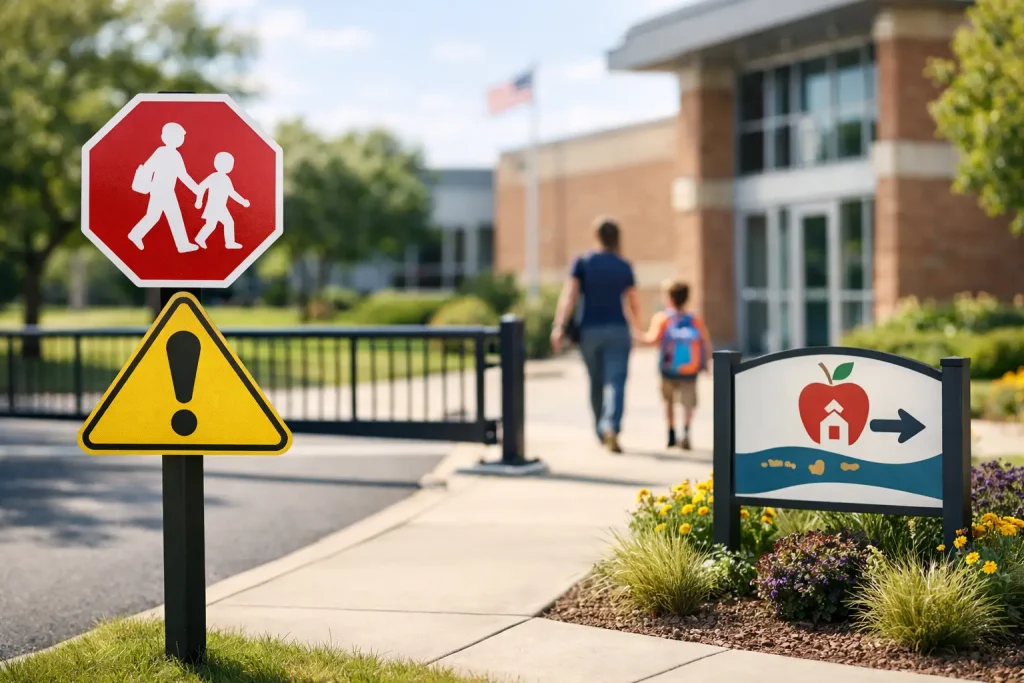
A school entrance has to work hardest at the busiest times of day. Parents need to know where to stop, visitors need to report safely, pupils need to recognise where they belong, and staff need a site that feels controlled rather than chaotic. Well-planned school entrance signs make those moments clearer. They do more than display a name: they support safeguarding, reduce avoidable questions at reception and give every visitor a confident first impression.
For schools, nurseries, academies and colleges, the most effective approach is to treat the entrance as a practical system. The welcome sign, road safety message, visitor instruction and wayfinding panel should work together, each doing one clear job.
Start with the job your entrance needs to do
Before choosing colours, materials or wording, stand at the site boundary and follow the route taken by a first-time visitor. Can they identify the main entrance? Do they know where to park, where not to park and where to report? Is there a separate pedestrian route from the vehicle entrance? These questions often reveal gaps that are easy to miss when staff use the same route every day.
A main school sign usually needs to establish identity and reassure visitors that they have arrived at the right place. It may include the school name, logo, address and contact details. However, it should not be expected to carry every operational message as well. When one board attempts to cover arrivals, parking, safeguarding, visitor procedures, nursery directions and event information, it becomes difficult to read from a distance.
Give each message its own place. A prominent entrance sign identifies the site. Directional signs guide people once they are on site. A clearly positioned reception notice tells visitors to sign in. Parking and road safety signs deal with vehicles before they reach the school gate.
School entrance signs should create a clear hierarchy
Visitors read signs in stages. From the road, they need a large, immediate cue that identifies the school and indicates the correct entrance. At the car park or gate, they need practical direction. At the door, they need precise instructions.
This hierarchy is particularly valuable on shared campuses, large secondary sites and schools with separate early years, sixth form or community entrances. It is also useful where the entrance is set back from the road or partly obscured by trees, fencing or parked cars.
The site identity sign
A fascia sign, post-mounted panel or monolith totem sign can provide a strong, permanent marker at the boundary. The right choice depends on available space, viewing distance and the character of the building. A monolith can be especially effective where a school needs a visible landmark from the road, while a wall-mounted sign may suit a compact frontage.
Include only information that needs to be seen quickly. The school name and logo are usually enough at distance. A telephone number or website address can be useful where visitors are likely to arrive outside normal hours, but very small text does not add value if it cannot be read safely.
Directional and visitor signs
Once visitors are through the gate, concise directional signs prevent uncertainty. Arrows to reception, visitor parking, pupil entrances, accessible access, the sports hall or a community facility should be placed at the point where a decision is needed, not after it.
At reception, a simple sign such as “All visitors must report to reception” reinforces safeguarding procedures without creating an unwelcoming tone. If visitors must use an intercom, wait behind a line or wear a badge, say so clearly. Consistent wording and symbols help staff manage arrivals with less intervention.
Temporary messages
Not every message requires a permanent panel. Pavement buddies, banners and changeable noticeboards are useful for open evenings, enrolment periods, performances, road closures and seasonal reminders. They can also provide a highly visible prompt during the school run, such as asking drivers to switch off engines or keep clear of the gates.
Temporary signage works best when it is genuinely temporary. Leaving out-of-date event banners or faded notices at the entrance can make even a well-maintained site appear neglected.
Put safety before decoration
A welcoming entrance is not one that is crowded with graphics. It is one where people understand what to do without taking risks or obstructing others. This matters most where vehicles, pedestrians and young children meet.
If dangerous stopping, blocked driveways or cars mounting pavements are regular concerns, use parking control and road safety signs before the congestion point. Clear messages such as “Keep Clear”, “No Parking” or “Protect our children, turn off your engine” are most effective when drivers see them early enough to act. A sign placed directly beside the problem may be too late.
School gate signage should support, rather than replace, sensible site management. Where possible, combine signs with marked pedestrian routes, appropriate barriers, designated drop-off arrangements and staff supervision at busy times. A clear sign cannot resolve a layout that forces people into conflict, but it can make a safer layout easier to follow.
Pavement signs deserve the same care. They should be stable, positioned so they do not narrow an accessible route, and brought in when they are no longer needed. A useful message becomes a hazard if it is placed thoughtlessly.
Make safeguarding messages firm and proportionate
The entrance is a key safeguarding point, but it should not feel hostile. The aim is to give clear boundaries while preserving the warm, professional environment families expect.
Visitor instructions should state what is required: report to reception, sign in, wear identification and remain accompanied where appropriate. Photographic restrictions, mobile phone expectations and collection procedures may also need to be displayed, particularly in early years settings. Keep the language direct and avoid lengthy policy text. A sign should prompt the correct action, while detailed information can be provided by staff when needed.
Consider what can be seen from the public side of the gate. Internal safeguarding information, pupil names, timetables or personal details should not be displayed where they are visible to passers-by. Noticeboards are valuable communication tools, but they need regular checks to ensure content remains appropriate and current.
Choose materials for the location, not just the budget
External school signage faces rain, UV light, mud, footballs, cleaning equipment and busy daily use. Material and fixing choices should reflect the position of the sign and the level of exposure.
A large identity sign at the front of the site is a long-term investment, so durable printed panels, quality frames and secure fixings are usually worth prioritising. Where appearance matters, a custom sign with school colours, logo and coordinated typography can make a significant difference to the frontage.
For lower-risk, short-term or frequently changing messages, a more flexible format may be better value. Banners and poster displays can respond quickly to changing needs, while permanent aluminium composite or rigid sign panels suit messages that are unlikely to change.
Think about maintenance at the point of purchase. Can staff clean the sign easily? Will branches cover it in summer? Is it likely to be struck by vehicles? Does the mounting position allow it to be updated or replaced without major work? These practical details affect the lifetime cost far more than the initial price alone.
Design for readability and inclusion
A sign can carry the right information and still fail if people cannot read it. Use good contrast between text and background, clear letterforms and enough space around each message. Avoid placing important wording over detailed photographs or busy patterns.
Viewing distance should guide text size. Information intended for drivers needs to be larger and simpler than wording read at a reception door. Directional arrows and familiar symbols can help where visitors may have limited English or need to make quick decisions.
Accessibility also means considering physical placement. Signs should be positioned where wheelchair users, children and adults can see them, without being blocked by bins, gates or parked vehicles. If there is an accessible entrance separate from the main door, it should be signed clearly from the first approach point rather than only at the door itself.
Branding still has a role. School colours, a mascot, welcoming wall graphics or pupil artwork can make an entrance feel distinctive and positive. The trade-off is clarity: use decorative elements to frame key information, not compete with it.
Plan the project around the whole approach route
The strongest school entrance projects rarely begin with a single sign. They begin with a short site review covering the road, gate, car park, paths, reception and exit route. Photograph problem areas at drop-off and collection times, when traffic flow and visibility issues are most obvious. Involve the site manager, reception team and safeguarding lead, as each will notice different problems.
Then separate the findings into permanent, temporary and seasonal requirements. This helps schools buy the right solution for each issue rather than using a banner where a fixed sign is needed, or commissioning a permanent board for information that changes every term.
For bespoke entrance displays, provide the school logo, preferred colours, exact location, approximate viewing distance and any required wording early in the process. This gives a specialist education signage supplier the information needed to recommend suitable sizes, formats and fixings. Signs 2 Schools can support both ready-to-order safety products and custom school signage where a coordinated entrance scheme is required.
Finally, assign ownership. Someone should check the entrance routinely for damaged panels, faded graphics, outdated notices and obscured directions. A five-minute walk-through at the start of each term can prevent small issues becoming a poor first impression.
A well-signed entrance quietly tells pupils, families and visitors that the school is organised, welcoming and serious about safety. That reassurance begins before anyone reaches reception.