01274 532 100


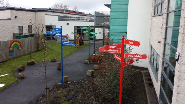
A parent arriving late for a meeting should not need to walk around the perimeter of the school looking for reception. Nor should a contractor be able to reach pupil areas without clear instructions, or a Year 7 pupil spendS their first week asking where the science block is. This school wayfinding signs guide explains how to make every journey around your site clearer, safer and easier to manage.
Good wayfinding is not simply a collection of arrows. It is a planned system that starts at the school boundary, directs people to the right place and supports safeguarding at every decision point. For busy schools, nurseries, colleges and academy sites, it can also reduce pressure on office staff and prevent avoidable congestion at the start and end of the day.
Start with the journeys people actually make
The best signage plans are based on real movement around the site, not a map drawn from the office. Walk the grounds at arrival time, during a fire drill if possible, and when visitors are expected. Notice where people hesitate, turn back, park incorrectly or enter through the wrong gate.
Most education settings need to consider several different journeys. Pupils need obvious, age-appropriate routes to classrooms, dining areas, toilets, playgrounds and pastoral support. Parents need to find reception, visitor parking and collection points without crossing restricted areas. Visitors, contractors and supply staff need clear instructions before they pass beyond the entrance. Staff need routes to car parks, offices, meeting rooms and shared facilities.
A large secondary school may need building names, block letters and floor-level directories. A compact primary school may get better results from a simple entrance sign, colour-coded zones and child-friendly wall graphics. The right approach depends on the size, layout and daily use of the site.
School wayfinding signs guide: map the decision points
A sign is most useful where someone has to make a choice. At the main gate, the choice may be between visitor parking, pupil drop-off and pedestrian access. At reception, it may be between the school office, hall, safeguarding lead or meeting room. At a corridor junction, it may be between the dining hall, classrooms and toilets.
Begin by identifying these decision points in order. Then decide what information a person needs at each one. A visitor should not be expected to remember a complicated instruction from a sign placed 100 metres earlier. Repeat essential directions where the route changes, particularly on larger campuses and around buildings with more than one entrance.
Keep wording short. “Reception this way”, “Visitor parking”, “Sixth Form Centre” and “All visitors report to reception” are clearer than long explanations. Arrows should point in the exact direction of travel and be consistent throughout the site. If one sign uses a blue arrow and another uses a green arrow for the same destination, the system quickly becomes harder to follow.
Build the route from the road to reception
For many schools, the first wayfinding problem begins before a visitor reaches the gate. Unclear access arrangements can lead to unsafe stopping, blocked driveways and pedestrians moving between vehicles. External signs should make the school entrance, visitor parking, delivery access and any separate pedestrian route easy to identify.
Where vehicle and pedestrian traffic share space, signs need to work alongside road markings, barriers and sensible site management. Parking control signs can support messages such as no stopping, keep clear, staff parking only and disabled parking. Pavement signs can help during events or temporary changes, but they must be positioned so they do not create an obstruction or reduce visibility.
At the boundary, be clear about which gates are for pupils, parents, visitors and vehicles. If a gate remains locked during the day, a sign should direct visitors to the correct entrance rather than leaving them to try doors or follow pupils through. This supports safeguarding and gives the school a more controlled, professional arrival experience.
Make reception the clear control point
Reception signage should do more than display the school name. It should tell visitors what to do next. A well-positioned welcome sign can direct people to ring a bell, use an intercom, show identification, sign in or wait for assistance. For sites with a separate administration entrance, make this distinction clear before visitors reach the wrong door.
Safeguarding messages should be firm without making the school feel unwelcoming. For example, signs can state that all visitors must report to reception, wear a visitor badge and remain accompanied where required. Photography restrictions, mobile phone rules and pupil collection procedures can be communicated at this point too, provided the sign is not overloaded with text.
If reception is not visible from the main gate, use a sequence of directional signs rather than one large board with every instruction. The visitor should feel guided at each stage. This is particularly important for parents attending assemblies, prospective families visiting an open evening and contractors arriving outside normal school hours.
Use colour, symbols and names consistently
A wayfinding system works best when its visual rules are predictable. Choose a small number of colours and use them consistently for zones, buildings or routes. For instance, the Early Years area might use a yellow identifier while the sports hall uses green. These colours can appear on directional signs, door signs, wall graphics and maps.
Colour should support text, not replace it. Some visitors may have colour vision deficiencies, may be unfamiliar with the site or may not read English confidently. Clear wording, high contrast and familiar symbols remain essential. A toilet symbol, first aid cross or wheelchair access symbol can make a sign quicker to understand, but each should be used accurately and in the same style across the school.
Naming also matters. If staff call a building “the old block” but site signs call it “Building C”, visitors will be confused. Agree the official names used on plans, emails, appointment letters and signs. Avoid changing them frequently unless there is a compelling operational reason.
Plan for pupils as well as adult visitors
Children use wayfinding differently from adults. Younger pupils benefit from simple visual cues, recognisable illustrations and signs installed at an appropriate height. Large lettering, bright but controlled colours and familiar images can help pupils move independently between shared spaces.
For secondary pupils, the priority is usually speed and clarity between lessons. Block identifiers, room numbers and corridor signs should be visible before pupils reach a junction. In large schools, a directory at key entrances can reduce the repeated question: “Where is room B24?”
Accessibility should be considered from the outset. Signs need legible typefaces, strong contrast, sensible positioning and routes that reflect accessible entrances, lifts and facilities. Tactile or braille information may be appropriate in some settings. The solution should reflect the needs of the school community rather than being added as an afterthought.
Separate permanent signs from temporary messages
Permanent wayfinding signs should communicate information that is unlikely to change: reception location, building names, toilets, fire exits, parking zones and accessible routes. Durable materials are worthwhile outdoors, where signs face rain, sunlight, cleaning and regular contact from pupils and visitors.
Temporary information needs a different format. Open evenings, parents’ evenings, examination access, roadworks and altered collection arrangements may require banners, pavement signs or removable notices. These are useful tools, but they should not obscure core directional signs or remain in place after the event has finished.
A common problem is the gradual build-up of printed notices on gates, windows and doors. When every surface carries a message, urgent instructions disappear into the background. Review temporary signs regularly and remove those that are no longer relevant.
Check safety and compliance alongside wayfinding
Wayfinding is part of a wider site-signage plan. It must not conflict with statutory fire safety, health and safety, traffic management or accessibility requirements. Fire exit signs, emergency information and mandatory safety notices need to remain visible and should never be replaced by decorative graphics or general directional signs.
Positioning is equally important. Signs should be readable from the intended approach, securely fixed and clear of doors, escape routes, vehicle sightlines and pedestrian paths. External posts, monolith signs and wall-mounted panels need materials and fixings suited to the location. A sign that looks smart on installation day but fades, loosens or becomes hidden by planting will not solve the problem for long.
Before ordering, ask staff and a small group of visitors to test the proposed route. Can they find reception without help? Can they locate the hall from the entrance? Can a delivery driver identify the correct access point? Their answers reveal gaps that a site team may no longer notice because they know the grounds so well.
Treat wayfinding as part of the school environment
Clear signs reduce uncertainty, but they also set expectations. They show that the site is organised, that visitors are expected to follow safeguarding procedures and that pupils can move around safely with growing independence. For schools investing in entrance signage, wall graphics, parking control or custom totem signs, wayfinding brings those elements together into a system people can genuinely use.
Signs 2 Schools can help education settings turn practical site issues into clear, durable signage that fits their environment. The most effective starting point is simple: stand at the gate, follow the visitor journey and make every next step obvious.